Genie Textarea

A powerful AI-enhanced textarea web component built with Svelte 5 that seamlessly integrates with the Serenity* Star AI platform. Transform any textarea into an intelligent text editor with AI-powered completions, suggestions, and content generation.
✨ Key Features
- 🤖 AI-Powered: Built-in integration with Serenity* Star AI platform
- 🎯 Easy Integration: Works as ES module, IIFE script, or jQuery plugin
- 🎨 Fully Customizable: Custom styling, icons, and behaviors
- 📱 Responsive: Auto-resizing textarea with modern UI
- 🔧 TypeScript Support: Complete type definitions included
- 🌐 Universal: Works with any framework or vanilla JavaScript
- ⚡ Lightweight: Minimal footprint with maximum functionality
- 🎛️ Dual Modes: Direct processing or assisted mode with quick actions and custom instructions
📦 Installation
NPM Installation
npm install @serenity-star/genie-textarea
CDN Usage (IIFE)
<script src="https://unpkg.com/@serenity-star/genie-textarea/dist/genie-textarea.iife.js"></script>
🚀 Quick Start
Basic HTML Setup
<!DOCTYPE html>
<html lang="en">
<head>
    <meta charset="UTF-8">
    <meta name="viewport" content="width=device-width, initial-scale=1.0">
    <title>Genie Textarea Demo</title>
</head>
<body>
    <!-- Container element that will be replaced -->
    <div id="my-textarea"></div>

    <!-- Include the IIFE script -->
    <script src="https://unpkg.com/@serenity-star/genie-textarea/dist/genie-textarea.iife.js"></script>

    <script>
        // Initialize the component
        genieTextarea('my-textarea', {
            apiKey: 'your-api-key',
            agentCode: 'your-agent-code',
            placeholder: 'Type your content here...',
            label: 'Content'
        });
    </script>
</body>
</html>
ES Module Usage
import { genieTextarea, defineElement } from '@serenity-star/genie-textarea';

// Register the web component
defineElement();

// Initialize the component
genieTextarea('my-textarea', {
    apiKey: 'your-api-key',
    agentCode: 'your-agent-code',
    placeholder: 'Type your content here...'
});
🤖 AI Integration
Serenity* Star Integration (Recommended)
Genie Textarea is designed to work seamlessly with Serenity* Star, a powerful AI platform for content generation and processing. This is the simplest and most powerful way to add AI capabilities to your textarea.
Getting Started with Serenity* Star
- Sign up at Serenity* Star
- Create an Agent for your specific use case
- Get your API key from the dashboard
- Use your agent code in the component
genieTextarea('my-textarea', {
    apiKey: 'sk-your-api-key-here',
    agentCode: 'your-agent-code',
    placeholder: 'Type something here...',
});
Custom Base URL
If you're using a custom Serenity* Star deployment:
genieTextarea('my-textarea', {
    apiKey: 'your-api-key',
    agentCode: 'your-agent-code',
    baseURL: 'https://your-custom-api.example.com/api/v2'
});
Input Parameters
Pass additional parameters to your Serenity* Star agent:
genieTextarea('my-textarea', {
    apiKey: 'your-api-key',
    agentCode: 'your-agent-code',
    inputParameters: {
        tone: 'professional',
        language: 'en',
        maxLength: 500
    }
});
Custom Completion Handler
For complete control over the AI completion process, use the handleRequestCompletion callback. When using this approach, agentCode and apiKey are not used.
genieTextarea('my-textarea', {
    handleRequestCompletion: async ({ content, instruction, addChunk, setContent }) => {
        try {
            // Your custom AI logic here
            const response = await fetch('https://your-ai-api.com/complete', {
                method: 'POST',
                headers: { 'Content-Type': 'application/json' },
                body: JSON.stringify({
                    text: content,
                    prompt: instruction
                })
            });

            if (response.body) {
                const reader = response.body.getReader();
                const decoder = new TextDecoder();

                while (true) {
                    const { done, value } = await reader.read();
                    if (done) break;

                    const chunk = decoder.decode(value);
                    addChunk?.(chunk); // Stream chunks to the textarea
                }
            }
        } catch (error) {
            console.error('Completion error:', error);
            // Handle error appropriately
        }
    }
});
🔧 Usage Patterns
ES Module Import
import { genieTextarea } from '@serenity-star/genie-textarea';

// Using factory function (recommended)
const instance = genieTextarea('textarea-id', options);

// Control the instance
instance.set('value', 'New content');
const currentValue = instance.get('value');
instance.aiButton.execute(); // Trigger AI completion
IIFE Script Tag
<script src="https://unpkg.com/@serenity-star/genie-textarea/dist/genie-textarea.iife.js"></script>
<script>
    // Global function available
    const instance = genieTextarea('my-textarea', {
        apiKey: 'your-api-key',
        agentCode: 'your-agent-code'
    });
</script>
jQuery Plugin Integration
// Requires jQuery to be loaded first
$('#my-textarea').genieTextarea({
    apiKey: 'your-api-key',
    agentCode: 'your-agent-code',
    placeholder: 'Enhanced with AI...'
});
Direct Web Component Usage
<!-- Use directly in HTML -->
<genie-textarea
    id="my-textarea"
    api-key="your-api-key"
    agent-code="your-agent-code"
    placeholder="Direct web component usage"
    label="Content"
    buttons-always-visible="true">
</genie-textarea>
Hybrid HTML + JavaScript Configuration
This approach allows you to declare a web component directly in HTML with basic setup, then enhance it with additional JavaScript configuration. This is perfect for gradual enhancement and framework integration.
<!-- HTML: Basic setup -->
<genie-textarea
    id="hybrid-example"
    api-key="your-api-key"
    agent-code="your-agent-code"
    placeholder="I was created in HTML and enhanced with JS!"
    label="Hybrid Configuration Example">
</genie-textarea>
// JavaScript: Enhancement
const instance = genieTextarea('hybrid-example', {
    contentParameterName: 'userMessage',
    value: 'This value was set via JavaScript!',
    handleValueChange: (value) => {
        console.log('Value changed:', value);
    },
    handleBeforeSubmit: async ({ content }) => {
        console.log('About to submit:', content);
        return true; // Proceed with submission
    }
});

// You can also use the instance to control the component
instance.set('placeholder', 'Updated via JavaScript!');
console.log('Current value:', instance.get('value'));
Key benefits of this approach:
- ✅ Framework-friendly: Works seamlessly with React, Vue, Angular, or any framework
- ✅ Progressive enhancement: Start with basic HTML, enhance with JavaScript as needed
- ✅ No DOM replacement: Existing components are preserved and enhanced in place
- ✅ DevExpress-like pattern: Get instances of already-initialized components
- ✅ Full control: Access all instance methods and properties for dynamic updates
Basic Usage Examples
Simple Textarea Replacement
// Replace any div with an AI-enhanced textarea
genieTextarea('content-area', {
    apiKey: 'your-api-key',
    agentCode: 'writing-assistant'
});
With Placeholder and Label
genieTextarea('article-content', {
    apiKey: 'your-api-key',
    agentCode: 'article-writer',
    label: 'Article Content',
    placeholder: 'Start writing your article...',
    value: 'Initial content here'
});
Track Value Changes
genieTextarea('email-composer', {
    apiKey: 'your-api-key',
    agentCode: 'email-assistant',
    label: 'Email Content',
    placeholder: 'Type your email or describe what you want to write...',
    handleValueChange: (newValue) => {
        console.log('Content updated:', newValue);
        // Save to your application state
    }
});
Always Visible Buttons
genieTextarea('chat-input', {
    apiKey: 'your-api-key',
    agentCode: 'chat-assistant',
    placeholder: 'Type your message...',
    buttonsAlwaysVisible: true, // Buttons stay visible even when not focused
    aiButtonProps: {
        text: 'AI',
        bgColor: '#22c55e'
    }
});
⚙️ Configuration Options
Complete Options Reference
interface GenieTextareaOptions {
    // Basic Configuration
    value?: string;                    // Initial content
    label?: string;                    // Label text
    placeholder?: string;              // Placeholder text

    // AI Integration (Serenity* Star)
    apiKey?: string;                   // Your Serenity* Star API key
    agentCode?: string;                // Your agent code
    baseURL?: string;                  // Custom API base URL (default: Serenity* Star)
    inputParameters?: Record<string, any>; // Additional parameters for your agent
    contentParameterName?: string;     // Parameter name for content (default: 'content')
    instructionParameterName?: string; // Parameter name for instruction (default: 'instruction')

    // UI Customization
    aiButtonProps?: {
        text?: string;                 // Button text
        bgColor?: string;              // Background color
        tintColor?: string;            // Text/icon color
        icon?: {
            type: 'img' | 'svg';
            src?: string;              // For img type
            content?: string;          // For svg type
            alt?: string;              // Alt text for img
            tintColor?: string;        // Icon color override
        };
    };
    buttonsAlwaysVisible?: boolean;    // Always show buttons (default: false, shows only on focus)

    // Undo Button Customization
    undoButtonProps?: {
        bgColor?: string;              // Background color
        tintColor?: string;            // Icon color
    };

    // Textarea Customization
    textareaProps?: HTMLTextareaAttributes; // Pass any HTML textarea attributes (rows, cols, maxlength, class, style, etc.)

    // Container Customization
    containerProps?: HTMLDivAttributes; // Pass any HTML div attributes to the container that wraps the textarea and buttons (class, style, data-*, etc.)

    // Label Customization
    labelProps?: HTMLLabelAttributes; // Pass any HTML label attributes (class, style, for, etc.)

    // Behavior
    mode?: 'direct' | 'assisted';     // Processing mode
    quickActions?: QuickAction[];     // Quick actions for assisted mode

    // Event Handlers
    handleValueChange?: (value: string) => void;
    handleRequestCompletion?: (args: CompletionArgs) => Promise<void>;
    handleBeforeSubmit?: (args: BeforeSubmitArgs) => Promise<boolean>;
    handleAgentResult?: (result: AgentResult) => Promise<void>;

    // Localization
    locale?: {
        contentMissingErrorMessage?: string;
        thinkingMessage?: string;
        completionErrorMessage?: string;
        undoButtonTooltip?: string;
        assistedMode?: {
            inputPlaceholder?: string;       // Placeholder for custom instruction input
            quickActionsTitle?: string;      // Title for quick actions section
        };
    };
}
Required vs Optional Parameters
Required for Serenity Star integration:*
apiKey- Your Serenity* Star API keyagentCode- Your agent code
Required for custom completion:
handleRequestCompletion- Custom completion handler
All other parameters are optional with sensible defaults.
Default Values
const defaults = {
    mode: 'direct',
    baseURL: 'https://api.serenitystar.ai/api/v2',
    contentParameterName: 'content',
    instructionParameterName: 'instruction',
    aiButtonProps: {
        bgColor: '#4862ff'
    },
    locale: {
        contentMissingErrorMessage: 'Content is required.',
        thinkingMessage: 'Thinking...',
        completionErrorMessage: 'An error occurred while processing your request.',
        undoButtonTooltip: 'Undo',
        assistedMode: {
            inputPlaceholder: 'Enter an instruction...',
            quickActionsTitle: 'Quick actions'
        }
    },
    inputParameters: {}
};
🎭 Modes
Direct Mode (Default)
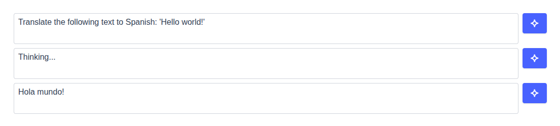
In direct mode, clicking the AI button immediately processes the current content with your AI agent. This is the default and currently available mode.
genieTextarea('my-textarea', {
    mode: 'direct', // Default mode
    apiKey: 'your-api-key',
    agentCode: 'your-agent-code'
});
How it works:
- User types content in the textarea
- User clicks the AI button
- Content is sent to the AI agent immediately
- AI response streams back and replaces/enhances the content
Assisted Mode
Assisted mode provides an interactive experience through a popover interface. Users can type custom instructions or choose from predefined quick actions.
genieTextarea('my-textarea', {
    mode: 'assisted',
    apiKey: 'your-api-key',
    agentCode: 'your-agent-code',
    quickActions: [
        {
            label: 'Translate to English',
            instruction: 'Translate this text to English',
            icon: {
                type: 'svg',
                content: `<svg viewBox="0 0 24 24" fill="currentColor">
                    <path d="M12.87 15.07l-2.54-2.51.03-.03c1.74-1.94 2.98-4.17 3.71-6.53H17V4h-7V2H8v2H1v1.99h11.17C11.5 7.92 10.44 9.75 9 11.35 8.07 10.32 7.3 9.19 6.69 8h-2c.73 1.63 1.73 3.17 2.98 4.56l-5.09 5.02L4 19l5-5 3.11 3.11.76-2.04zM18.5 10h-2L12 22h2l1.12-3h4.75L21 22h2l-4.5-12zm-2.62 7l1.62-4.33L19.12 17h-3.24z"/>
                </svg>`,
                tintColor: '#3b82f6'
            } // Example using SVG icon
        },
        {
            label: 'Fix Grammar',
            instruction: 'Fix any grammar and spelling errors in this text'
        },
        {
            label: 'Make Professional',
            instruction: 'Improve the tone of this text to make it more professional and friendly'
        }
    ],
    locale: {
        assistedMode: {
            inputPlaceholder: 'Enter your custom instruction...',
            quickActionsTitle: 'Quick Actions'
        }
    }
});
How it works:
- User types content in the textarea
- User clicks the AI button to open an interactive popover
- User can either:
- Type a custom instruction in the input field
- Choose from predefined quick actions
- AI processes the content with the chosen instruction
- AI response streams back and replaces/enhances the content
🎨 Customization
Textarea Customization
You can pass any standard HTML textarea attributes through the textareaProps option to customize the behavior and appearance of the textarea element. This provides full control over the underlying textarea while maintaining the AI functionality.
genieTextarea('my-textarea', {
    apiKey: 'your-api-key',
    agentCode: 'your-agent-code',
    textareaProps: {
        // Styling
        class: 'my-custom-textarea-class',
        style: 'border-radius: 12px; font-size: 16px;',

        // Behavior
        rows: 5,
        cols: 40,
        maxlength: 1000,
        readonly: false,
        required: true,
        spellcheck: true,
        wrap: 'soft',

        // Accessibility
        'aria-label': 'AI-enhanced text input',
        'aria-describedby': 'textarea-help',
        tabindex: 1,

        // Form integration
        name: 'content',
        form: 'my-form',

        // Events
        onfocus: (e) => console.log('Textarea focused'),
        onblur: (e) => console.log('Textarea blurred'),
        onkeydown: (e) => {
            if (e.key === 'Tab') {
                // Custom tab handling
            }
        }
    }
});
Note: The value, and placeholder props are handled separately by the component's dedicated properties and should not be passed through textareaProps. Custom classes in textareaProps.class will be merged with the component's default styling.
Container Customization
You can customize the container that wraps the textarea and buttons using the containerProps option. This allows you to style the outer container, add custom classes, and set any HTML div attributes.
genieTextarea('my-textarea', {
    apiKey: 'your-api-key',
    agentCode: 'your-agent-code',
    containerProps: {
        // Styling
        class: 'my-custom-container-class shadow-lg',
        style: 'border-radius: 12px; background-color: #f9fafb; border-color: #3b82f6;'
    }
});
Note: Custom classes in containerProps.class will be merged with the component's default container styling.
Label Customization
You can also customize the label element using the labelProps option. This allows you to style the label, set its text, and add any HTML attributes you need.
genieTextarea('my-textarea', {
    apiKey: 'your-api-key',
    agentCode: 'your-agent-code',
    label: 'Your Content',
    labelProps: {
        class: 'my-custom-label-class',
        style: 'font-weight: bold; color: #374151;',
        for: 'my-textarea', // Associate label with textarea
        id: 'textarea-label',
        tabindex: 0, // Make label focusable
        'aria-label': 'Content input label'
    }
});
Note : The children prop is not supported in labelProps since the label text is set through the label option. The component will automatically handle the association between the label and textarea.
UI Customization
Custom AI Button with Text and Colors
genieTextarea('my-textarea', {
    apiKey: 'your-api-key',
    agentCode: 'your-agent-code',
    aiButtonProps: {
        text: 'Enhance',
        bgColor: '#10b981', // Green background
        tintColor: '#ffffff' // White text/icon
    }
});
Custom SVG Icon
genieTextarea('my-textarea', {
    apiKey: 'your-api-key',
    agentCode: 'your-agent-code',
    aiButtonProps: {
        bgColor: '#7c3aed',
        icon: {
            type: 'svg',
            content: `<svg viewBox="0 0 24 24" fill="currentColor">
                <path d="M12 2l3.09 6.26L22 9.27l-5 4.87 1.18 6.88L12 17.77l-6.18 3.25L7 14.14 2 9.27l6.91-1.01L12 2z"/>
            </svg>`,
            tintColor: '#fbbf24' // Gold star
        }
    }
});
Custom Image Icon
genieTextarea('my-textarea', {
    apiKey: 'your-api-key',
    agentCode: 'your-agent-code',
    aiButtonProps: {
        bgColor: '#dc2626',
        icon: {
            type: 'img',
            src: '/path/to/your/icon.png',
            alt: 'AI Assistant'
        }
    }
});
Button Visibility Control
By default, the AI and undo buttons only appear when the textarea is focused to provide a clean interface. You can make them always visible using the buttonsAlwaysVisible option:
genieTextarea('my-textarea', {
    apiKey: 'your-api-key',
    agentCode: 'your-agent-code',
    buttonsAlwaysVisible: true // Buttons are always visible
});
Behavior:
false(default): Buttons appear only when the textarea is focusedtrue: Buttons are always visible regardless of focus state
Undo Button Customization
The undo button automatically appears after AI processing completes, allowing users to restore the original content. You can customize its appearance and tooltip:
genieTextarea('my-textarea', {
    apiKey: 'your-api-key',
    agentCode: 'your-agent-code',
    undoButtonProps: {
        bgColor: '#f59e0b',    // Orange background
        tintColor: '#ffffff'   // White icon
    },
    locale: {
        undoButtonTooltip: 'Restore original text'
    }
});
CSS Styling Options
The component includes scoped styles, but you can customize the appearance:
/* Target the root container */
.genie-textarea-root {
    font-family: 'Your Custom Font', sans-serif;
}

/* Target the inner container (textarea + buttons wrapper) */
.genie-textarea-root .my-custom-container-class {
    border: 2px solid #3b82f6;
    border-radius: 12px;
    background: linear-gradient(135deg, #f0f9ff 0%, #e0f2fe 100%);
    padding: 16px;
    box-shadow: 0 4px 6px -1px rgba(0, 0, 0, 0.1);
}

/* Style the textarea */
.genie-textarea-root textarea {
    border-radius: 8px;
    border: 2px solid #e5e7eb;
    font-size: 16px;
    line-height: 1.5;
}

/* Style the textarea on focus */
.genie-textarea-root textarea:focus {
    outline: none;
    border-color: #4862ff;
    box-shadow: 0 0 0 3px rgba(72, 98, 255, 0.1);
}

/* Style the label */
.genie-textarea-root label {
    font-weight: 600;
    color: #374151;
    margin-bottom: 8px;
    display: block;
}
Behavior Customization
Event Handlers
genieTextarea('my-textarea', {
    apiKey: 'your-api-key',
    agentCode: 'your-agent-code',

    // Called whenever the content changes
    handleValueChange: (newValue) => {
        console.log('Content changed:', newValue);
        // Save to localStorage, update form state, etc.
        localStorage.setItem('draft', newValue);
    },

    // Called before AI processing starts
    handleBeforeSubmit: async ({ content, instruction, setContent, setInstruction }) => {
        console.log('About to process:', { content, instruction });

        // You can modify the content or instruction before processing
        if (content.length < 10) {
            alert('Please provide more content for better AI assistance');
            return false; // Cancel the AI processing
        }

        // Add context or modify the content
        setContent(`Context: This is a blog post.\n\n${content}`);

        return true; // Proceed with AI processing
    },

    // Called when AI processing completes
    handleAgentResult: async (result) => {
        console.log('AI processing completed:', result);
        // Log analytics, show success message, etc.

        // Show success notification
        showNotification('Content enhanced successfully!');
    }
});
Custom Completion Logic
genieTextarea('my-textarea', {
    handleRequestCompletion: async ({ content, instruction, addChunk, setContent }) => {
        console.log('Starting custom completion...', { content, instruction });
        // Your custom logic goes here...
    }
});
Localization
genieTextarea('my-textarea', {
    apiKey: 'your-api-key',
    agentCode: 'your-agent-code',
    mode: 'assisted',
    locale: {
        contentMissingErrorMessage: 'Por favor, proporciona contenido para procesar.',
        thinkingMessage: 'Pensando...',
        completionErrorMessage: 'Ocurrió un error al procesar tu solicitud.',
        undoButtonTooltip: 'Deshacer',
        assistedMode: {
            inputPlaceholder: 'Ingresa una instrucción...',
            quickActionsTitle: 'Acciones rápidas'
        }
    }
});
Quick Actions
Quick actions provide predefined instructions that users can quickly select from the assisted mode popover interface. Each quick action can include custom icons.
genieTextarea('my-textarea', {
    mode: 'assisted',
    apiKey: 'your-api-key',
    agentCode: 'writing-assistant',
    quickActions: [
        {
            label: 'Improve Writing',
            instruction: 'Improve the grammar, clarity, and flow of this text',
            icon: {
                type: 'svg',
                content: `<svg viewBox="0 0 24 24" fill="currentColor">
                    <path d="M12 2C6.48 2 2 6.48 2 12s4.48 10 10 10 10-4.48 10-10S17.52 2 12 2zm-2 15l-5-5 1.41-1.41L10 14.17l7.59-7.59L19 8l-9 9z"/>
                </svg>`,
                tintColor: '#10b981'
            }
        },
        {
            label: 'Make Professional',
            instruction: 'Rewrite this text in a professional tone',
        },
        {
            label: 'Summarize',
            instruction: 'Create a concise summary of this content',
        }
    ]
});